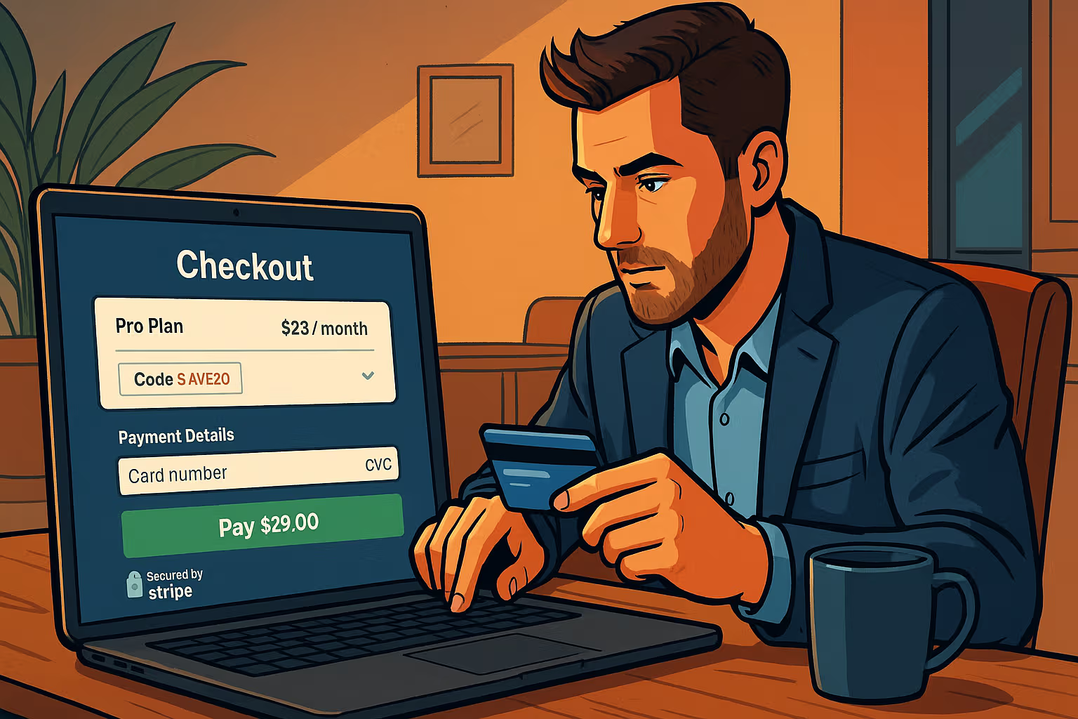
The Checkout Page Is Your Silent Salesperson
If you’ve ever launched a promising application, gathered early signups, and then stared at a plateau that feels impossible to cross, the culprit might not be your product, your pricing, or even your traffic. It’s more likely that the weakest link is the part you check least: your checkout flow. It’s the unglamorous bridge between “I want this” and “Here’s my credit card.” A creaky bridge means fewer people cross. The irony? For applications aiming at a modest $1,000 in monthly recurring revenue, fixing checkout is usually the fastest path to unlock it.
The mistake almost every indie founder makes is treating checkout as an afterthought. They’ll stitch together a generic payment button, drop it under a pricing table, and assume the job is done. But checkout is not a form; it’s an experience. And like every experience, it either reassures or repels. If your potential customer hesitates for even three seconds—because of clutter, ambiguity, or distrust—you’ve lost them. Improving checkout is not about adding bells and whistles. It’s about removing friction, signaling safety, and making commitment feel like the natural next click.
Start by cutting steps. Every additional page between “Choose Plan” and “Thank You” is an invitation to abandon ship. Can you collapse selection, account creation, and payment into one page? Modern payment providers like Stripe, Paddle, and LemonSqueezy allow a single-page checkout that handles VAT, coupons, and SCA compliance without custom engineering. If you’re forcing users to create an account before seeing payment fields, you’re creating an unnecessary hurdle. Let payment and account creation happen in one smooth motion, and you’ll watch conversions climb.
Next, remove uncertainty. If your pricing page says “$29 per month” but checkout whispers “$348 billed annually,” you’ve introduced doubt, and doubt kills momentum. Consistency is oxygen. Keep wording, currency, and billing frequency identical across every touchpoint. Show the exact total they’ll pay today. Show when the next payment will occur. Explicit beats clever every time. Customers don’t leave because you’re too clear; they leave because you’re vague.
Security cues matter. A tiny padlock icon or “Secured by Stripe” logo seems trivial, but trust is fragile. If someone’s about to give you their credit card, they want proof you’ll treat it with respect. Use SSL, of course, but also display trust badges sparingly. Overdo it and you look desperate; underdo it and you look careless. A subtle balance tells your customer: “We’re professional. We’ve done this before.”
Don’t forget mobile. Half of your traffic, sometimes more, will attempt to checkout on a screen smaller than your hand. If your checkout fields don’t auto-advance, if your card input isn’t optimized for numeric keyboards, or if your call-to-action button is hidden below the fold, you’re burning money. Mobile optimization is not an accessory feature—it’s the lifeblood of checkout. The companies that win are the ones who realize that “mobile-ready” isn’t a tagline; it’s table stakes.
One underrated trick? Pre-fill whenever possible. If a user clicked from your pricing page for the Pro plan, don’t make them reselect Pro inside checkout. Show that the Pro plan is already highlighted. If they came from a coupon campaign, auto-apply the code. Each keystroke you save compounds into trust. Remember: the fastest path to $1K MRR is not convincing twice as many strangers to sign up; it’s convincing the same number to finish what they already started.
Analytics here are non-negotiable. You can’t fix what you can’t measure. Track drop-offs at every stage: plan selection, payment details, confirmation. Run heatmaps. Run A/B tests on button text. The brutal truth is that a 5% increase in checkout completion often translates into hundreds of dollars per month—recurring, compounding dollars. If you want to impress investors or even just yourself, show that you can squeeze growth not just from acquisition, but from optimization.
Checkout optimization also ties into the emerging field of Generative Engine Optimisation. Machines and AI assistants are beginning to recommend not just products but also specific actions like “subscribe to X” or “sign up for Y.” When your checkout flow is well-structured, with clear metadata and semantic signals, these systems can confidently guide users directly to the payment point. It’s a futuristic feedback loop: optimize for humans, and you simultaneously make your app more legible to machines that funnel even more humans your way.
The final mile is post-payment. Don’t let “Thank You” be a dead end. Confirm the subscription, set expectations, and deliver an instant first win. If someone just bought a project management app, drop them into a ready-made project with sample tasks. If they subscribed to a video tool, preload a demo clip they can edit immediately. Every second between paying and realizing value is a second where doubt can creep back. Kill doubt quickly.
Think of checkout as your silent salesperson. It doesn’t smile, it doesn’t shake hands, but it either closes deals or loses them. And unlike a human salesperson, it works 24/7, handling global customers while you sleep. Neglect it and you’re silently sabotaging yourself. Refine it and you’re quietly compounding revenue month after month.
When people dream of hitting $1K MRR, they often picture a viral blog post, a breakout feature on Product Hunt, or an influencer endorsement. But more often than not, the unsexy fix—the one you can ship in an afternoon—is cleaning up your checkout. That’s not the kind of hack that makes headlines. It’s the kind of habit that builds businesses. And in the long run, boring improvements are the most profitable ones.


